
What is Google Looker Studio?
Why Use Google Looker Studio?
Google Looker Studio Limitations
How to Use Google Looker Studio
Google Looker Studio: Practical Tips and Tricks
What is Google Looker Studio?
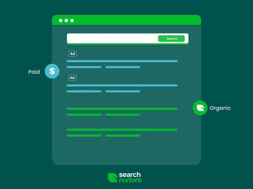
All great marketing teams know how much information is needed in order to conceptualize a campaign strategy — and to make the appropriate pivots when necessary. Collecting all the myriad data sources, combining insights from cross-channel campaigns, and gathering everything in one easy-to-analyze resource can be a huge pain.
This is where Google Looker Studio comes in.
Looker Studio is a data visualization tool that gathers all those datasets in one convenient dashboard. Using this tool, you can turn dizzying numbers into an informative report using charts, graphs, data tables, and more. Not only does it enable you to collect and make sense of disparate data, but it also allows you to generate easy-to-read reports for clients and campaign stakeholders.
Why Use Google Looker Studio?
Initially, GDS was a paid reporting tool called Google Data Studio 360.
Second, and more importantly, as a Google product, it’s designed to integrate with other Google Marketing Platform essentials like Google Analytics, Google Ads, Google Display, and YouTube. It’s also compatible with other Google tools like Sheets and Search Console.
Third, you can use unlimited widgets with Looker Studio, unlike Google Analytics, which sets a limit of 12 graphs or charts per report.
Fourth, as a widely used tool, Looker Studio boasts a rich array of ready-to-use templates. There are pre-made templates for sources like YouTube or Google Analytics, and there are even templates for different industries, such as eCommerce.
Finally, it allows seamless collaboration. As a fully cloud-based platform, it can be accessed using Google Docs, or shared on various social media platforms. What’s more, reports are dynamic and fully customizable.
Google Looker Studio Limitations
While Looker Studio is one of the most popular data visualization tools, it does have some drawbacks to be aware of:
- Google-centric – Since Looker Studio is a Google product, it’s designed for use with the GA360 ecosystem. This is great if your data source is Google Analytics or other Google tools, but anything else not Alphabet-owned might require some SQL or ETL tweaking to be integrated, or a third-party tool like Supermetrics will provide connectors.
- Data source support – Looker Studio does not offer direct integrations with all marketing channels. Therefore, to properly align the data with the visualization, additional skills or coding may be required.
- No auto-refresh – You’ll be able to get very close to viewing real-time data using Looker Studio. However, some of the connections, especially if they are processing large data sets, may take time to load and are not as responsive as viewing data directly in the platform.
- Lack of Excel support – As a Google product, it only supports Sheets. This isn’t the biggest problem, as you can convert generated reports to CSV for Excel into Google Sheets files.
- Online only – As a cloud-based tool, it can only be accessed on the Internet, and it was only recently that Google included PDF export support.
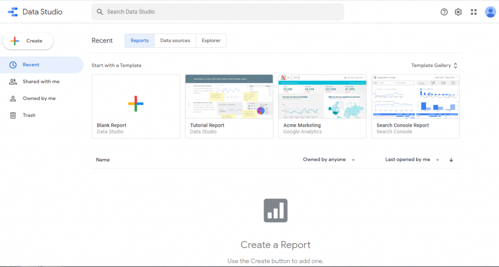
How to Use Google Looker Studio
Like most Google products, Looker Studio is designed to be fast, easy, and intuitive to use. Here’s how to set up an account.
1. Logging in
- Make sure you’re logged on to your Google account
- Go to lookerstudio.google.com
- Click on the “Home” tab to see the dashboard
2. Main menu basics
On top, you will see three tabs:
Reports – This is where you can see all of the reports, the Looker Studio equivalent of workbooks in Excel.
Data Sources – You can add up to 500+ sources. Popular ones include Ads, Analytics, Search Console, BigQuery, Google Display, and YouTube Analytics.
Explorer – This is a Preview mode, where you can experiment in a sandbox version of the report without modifying the actual report itself.
In the main window meanwhile, you will see the Template Gallery, which a helpful collection of pre-made templates that cover different data sources or industries.
3. Connecting data sources
There are two ways to add data: you can either create a new report or you can click on “Connect to Data” from the left menu.
When connecting data, Looker Studio uses connectors to fetch the data from their original sources. Some of these connectors are for use with other Google products and are therefore free. However, connectors for non-Google platforms may be paid. All these connectors can be viewed at the Connector Gallery. Like the Template Gallery, it contains a trove of Google-created and third-party connectors that allow connections to over 800 data sets.
4. Creating reports
Charts – These are the main elements of a report that display and visualize data.
- To insert a chart, click “Add a chart” from the toolbar.
- You can also create charts by dragging a field from the “Available fields” panel into the report.
- Dragging a text or number will create a table.
- Dragging a date will create a time series.
- Dropping other metrics will generate a scorecard.
- You can try out different chart types by using the chart icons at the top of the panel. This allows you to determine which type of chart best displays the current data set.
Fields – Each chart can be customized and labeled accordingly.
- To add a field, click the chart and choose the “Data” tab.
- Look for the “Available fields” list on the right and drag it into an empty slot.
Other components – Elements like style components, images, videos, Google Docs, and external links can be added to the report.
- To add other elements, click on “Insert” from the top menu.
- Use the different toolbars to search for the appropriate element to add.
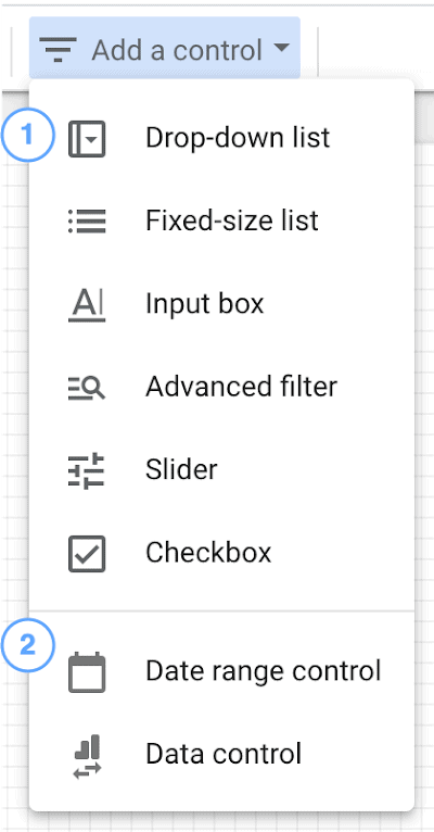
Interactive elements – You can make charts interactive and allow viewers to drill down into the data or customize ranges such as dates.
- From the toolbar, click “Add a control”.
- Select the appropriate control type for viewers.
- On the right side, use the options to configure settings such as parameters and dimension values.
5. Data blending
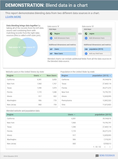
You can blend data from multiple sources to create a more cohesive picture of the campaign. By default, charts only use a single data source, but you can blend data from up to 5 different sources.
- To create a chart with blended data, click on the “Data” panel, then Data Source > Blend Data.
- To create a chart with joined data from multiple charts, select the charts, right-click on one, then click “Blend Data”.
For more information on data blending, you can refer to the Looker Studio’s data blending tutorial page.
6. Using calculated fields
You can create new metrics to showcase new information that may not be readily apparent from data sources. This can be done using calculated fields, which is a formula that applies to one or more existing fields from your data sources.
Much like Excel formulas, calculated fields can do math, manipulate ranges, or use branching logic to display new metrics.
- To create a calculated field in a data source, click “Add a field” on the top right.
Enter a name for the field, followed by the formula to be used. Then you modify the Type, Aggregation, and Show As options for the new field.
- To create a calculated field in a chart, choose either “Add Dimension” or “Add Metric” on the right, depending on the type of field you’re aiming for.
A full list of the formulas and functions that can be used can be found on the Looker Studio help section.
7. Sharing the report
You can invite specific users or Google Groups to access the report.
- To share the report, click “Share” on the top right.
- Access permissions – You can choose between Owner (with full editor permission), Can Edit, and Can View (read-only).
- Note that a Google account is needed to view or edit reports.
- For recipients without a Google account, you can email a PDF version of the report by setting up an automated email delivery schedule.
- Reports can also be shared on social media networks like Facebook, LinkedIn and Twitter, or IM platforms like Slack, simply by pasting the report URL.
Google Looker Studio: Practical Tips and Tricks
- Most connectors have a live connection to the data, which means they get updated in real-time. But some use an in-memory cache for better performance, and you may need to adjust
- Whenever you place new objects on the report, they snap-to-grid. To customize their position outside of the grid lines, hold down the shift key while moving the object with your mouse. The grid size can also be changed in the “Report Layout” menu.
- You can create calculated blended fields, which is a combination of data from different sources that can be filtered. Simply select the blended data source, then click Add Metric > Add New Field.
- Use heatmaps to help with the presentation of the data. A heatmap can highlight the top or bottom figures in the table automatically, so you won’t have to manually do it. On the panel, click Style > Heatmap.
- If the table contains dozens of rows resulting in an overly long table, you can use metric sliders to make the table more compact while allowing viewers to set the range on their own. On the panel, click Data > Metric toggle (on or off).
- Use colors to your advantage, either to reflect your brand or draw more attention to critical metrics. Use eye-catching colors for crucial scorecards, median colors for non-critical information, and client or company palettes in the report template. Remember that each and every element is fully customizable!